Meuhedet Public Website
Meohedet | Website redesign
ROLE
UI/UX Design
PROJECT'S TOOLS
Figma, Figma Make
Perplexity, Gemini, Nano-banana

USERS
The Challenge & The Solution
Meuhedet needed to modernize its public-facing website. The challenge was transforming a massive, content-heavy platform into an intuitive and accessible experience. The solution focused on a completely revamped navigation structure, scalable architecture, and a fresh, clean visual language that guides users effortlessly to the right medical information and services.
Site Architecture

Navigation Strategy

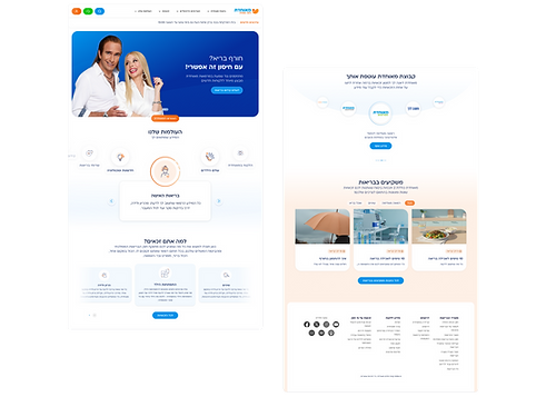
THE HOMEPGAE
Balancing Brand and Utility
The homepage was designed to serve both marketing goals and user needs without visual clutter. For the Hero section, I toned down the typically aggressive campaign language, opting for clean, modern geometric shapes that retain the brand's presenters in a calm, product-oriented environment.
To simplify navigation, I introduced the "Our Worlds" carousel. A highly visual component featuring a custom-designed icon language, allowing users to intuitively explore broad medical categories right from the start.


RESPONSIVE
Adaptive Design for Diverse Audiences
While the majority of users access the platform via mobile, a significant portion of Meuhedet's audience (specifically the Ultra-Orthodox community) relies entirely on desktop. This required a meticulously planned responsive strategy.
Working closely with the development team, I ensured that every component - from complex search filters to dense medical content - adapts seamlessly across all breakpoints. Whether expanding for wide desktop views or scaling down for mobile, the interface maintains its usability, accessibility, and visual harmony.

WORLD > DOMAIN > TOPIC
Designing for Depth
To handle vast amounts of medical content, I created a continuous, scalable visual hierarchy: World > Domain > Topic. As users dive deeper into specific medical conditions, the UI dynamically adapts while maintaining a cohesive brand identity and clear orientation.


SEARCH
Frictionless Search & Discovery
For an HMO website, finding the right care quickly is the most critical user journey. I designed a unified, accessible search experience that guides users intuitively.
Starting with a quick-action 'smart search' modal, users can easily filter complex data across doctors, clinics, and services. The doctor's mobile profile is structured to present dense logistical information—like availability, languages, and reception hours—in a highly scannable, bite-sized format, making the booking decision effortless.


Transforming a complex medical portal into a seamless, modern digital experience
